

Tuesday, December 15, 2009


Monday, December 14, 2009
Minimal Posters

Minimalist interpretation of one of my favorite movies, The Royal Tenenbaums.
---------

Emma Cason-Pratt
ART509
Sunday, December 13, 2009
"Yo amo Miami" poster design

Growing up in Miami, I had always somewhat disliked most places that make Miami a destination. But now that I'm older and maybe also because I'm planning on leaving when I graduate, I've actually fallen in love with this city. It still has some downsides, but at the end of the day, it's a great place to call home.
Emma Cason-Pratt, ART509
Thursday, December 10, 2009
deflated

on the weekends i am a clown. so for my final project typeface, i decided to create 'deflated,' in honor of my deflated balloons.
stacey nicole coon
Wednesday, December 9, 2009
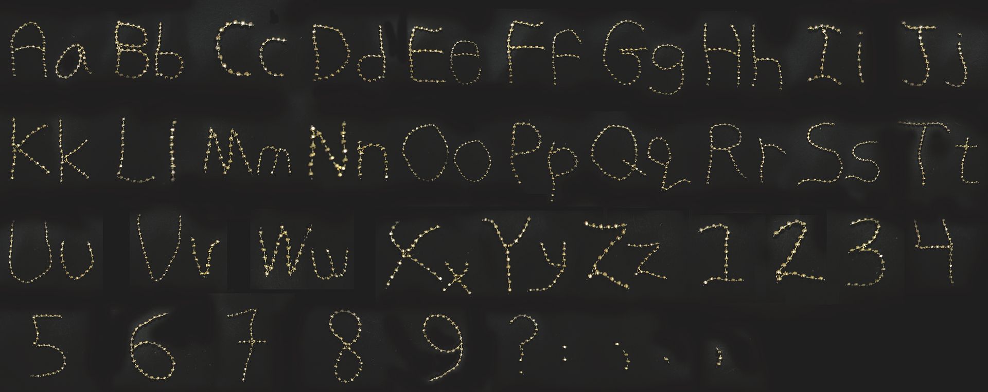
Alphabet (in class assignment)

Using another font as a template, I created Ark Ink, which is short for marker ink.
stacey nicole coon
message in the trees

photo i took in guatemala turned into an illustration with a message in the trees. the message explains where i felt on that entire trip, in a DREAM.
stacey nicole coon


Sequence
These three images depict a short story entitled "For a Breath I Tarry" by Roger Zelazny. The first shows the setting from the beginning of the story when Frost is in space studding man's work. The second is when Frost implants his mind into a body and experiences fear for the first time. And the third shows how the story ends, with Frost and Beta as humans to inhabit the planet.
ART 493. Fall 2009
Recent Work


Tuesday, December 8, 2009

Monday, December 7, 2009
Tuesday, December 1, 2009


Monday, November 23, 2009
the DISTRACTION of my semester

this is the cover of the fall 2009 issue of distraction magazine- the magazine of the students of the university of miami.
1. magazine= distraction
2. theme of the issue= take action
3. a little bit of effort can be all the change we need, and this is depicted through the 'evolution of man' idea picking up a piece of trash and throwing it out.
4. i hand drew the entire cover, using a sketchbook and pens, colored pencils, markers, and the like. i then scanned it in to touch it up on illustrator.
peace&love
stacey nicole coon
T-Shirt Design

this design was inspired by a weekend of "removing myself" of all distractions, and following all my intuitive thoughts. it describes an enlightening moment in my own life, as well as a close friend of mine who experienced the same thing, the same time, on the same days, in the same weekend. unexplainable occurrences explained only by this quote, that i had articulated after it all happened.
peace&love
stacey nicole coon
Thursday, November 19, 2009


Tuesday, November 17, 2009
Tuesday, October 27, 2009

Saturday, October 24, 2009
Narrative- Self-Made widow

This is my depiction of a narrative story I wrote during high school entitled "Self-Made Widow". The wife found out her husband was cheating on her and plotted to both poison him and then finish the job by killing him with a machete. The red(which appears blue) symbolizes both love and hate. It shows the love of their marriage and the blood of its destruction.
Editorial- World Peace

This illustration was created to display world peace. The words that are crossed out are words that represent negativity and are often the cause of the lack of peace. The illustration was created using pencil and ink.
Friday, October 23, 2009
Fortune Favors the Bold

Vernacular Typography, Art 293
Alexandra Barron
Dayna Bieber
Matthew Boswell
Francisco Cabana
Emma Cason-Pratt
Stephanie Colbert
Jessica Page
Taylor Palmer
Pedro Rodriguez
Jonathan Turner
Maria Urbano
Lauren Whiddon


Thursday, October 22, 2009


Tuesday, October 20, 2009
exploring magazine layout

we had to make a magazine layout, but I wanted to give it something more than a generic, simple spread. i had worked on a magazine over the summer that was stylishly simple, with lots of white space. i am also the creative director of distraction magazine here at UM, so the whole 'rectangle' magazine thing wasn't going to cut it for this assignment.
i wanted to make it really unique. something unexpected. so, i made it an oval shape--when it is opened. the content could be anything, but i chose outer space and dark energy since it was on my mind at the time.
enjoy!
-stacey nicole coon
Subscribe to:
Posts (Atom)