

Wednesday, March 29, 2023
Thursday, March 23, 2023
Peaks and Shallows

I did this study with watercolor at Lake Osceola on the campus of the University of Miami. The greatest challenge was to work around the white highlights in the beginning, as proper watercolor dictates that one should not use white paint afterwards. I layered values of blue, working from low opacity to high opacity to build the forms of the ripples. This exercise gave me good insight into how to use different amounts of water to make strokes of different values.
Wednesday, March 8, 2023


Monday, March 6, 2023
Gaia, our Mother

This is a colored pencil illustration inspired by a sculpture in the Lowe Art Museum. It is a rendition of Mother Earth as a mountain.
Wednesday, March 1, 2023

The 1000 Year Coconut

This illustration was made with pen and watercolor. The subject is a capital P represented in form with a palm tree. The linework creates the majority of the forms, with the watercolor loosely applied and not confined within the lines. The background is abstracted, with splashes of yellow to represent sand and the sun. Splotches of green on the horizon line indicate further vegetation in the distance but the hierarchy is clearly focused on the P.
Condor Typography Specimen Poster
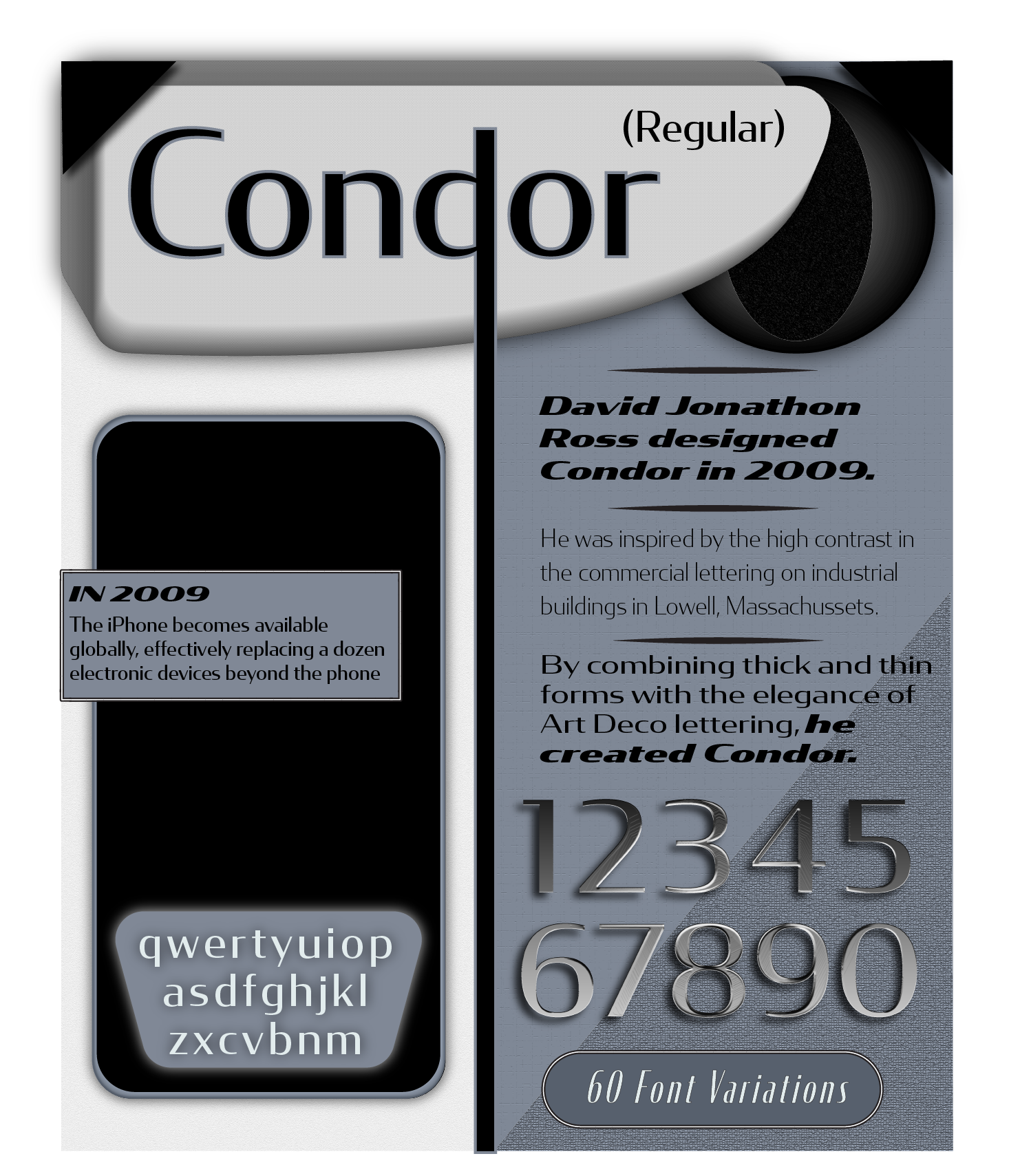
This is a typography specimen poster for Condor, created by David Jonathon. The font was created in 2009, a time in which the iPhone gained massive popularity and global availability. The overall design of the poster is inspired by the appearance of the late 2000's technology replaced by the iPhone, including cool grays, chrome finishes, and basic shapes.
Snell Roundhand

The Snell Roundhand Typeface
I have always loved the script style as that is how I write personally. It is a script typeface that was designed to have the style of simplicity and efficiency. You see the letters close together, but the spacing is easy to distinguish. Here I wrote who created it, and how it looks in capital letters, lowercase letters, and numbers. I used an "S" to create a pattern on the lefthand side of the picture plane. I also illustrated the word "Round" In a square box.
Grasshopper and the Ant

This illustration is inspired by Aesop's fable "The Ants and the Grasshopper." The fable tells of a grasshopper that spends his entire summer playing music instead of storing food like his ant companions. When winter comes, the grasshopper starves and begs the ants for food.
The story intends to promote hard work and preparation, but I chose to illustrate the need for balance in life. The grasshopper is not intrinsically wrong for wanting to enjoy summer, he just should have also taken care of himself. Likewise, the ants are not wrong for taking responsibility for their survival. They both just lack balance. While the original script teaches the dangers of too much pleasure, my flipped dialogue teaches the dangers of too much work - missing out on actually living.
The Addicted Lover

The Addicted Lover aims to find their beloved because they cannot live without them.
Subscribe to:
Posts (Atom)