

Tuesday, October 27, 2009
Saturday, October 24, 2009
Narrative- Self-Made widow

This is my depiction of a narrative story I wrote during high school entitled "Self-Made Widow". The wife found out her husband was cheating on her and plotted to both poison him and then finish the job by killing him with a machete. The red(which appears blue) symbolizes both love and hate. It shows the love of their marriage and the blood of its destruction.
Editorial- World Peace

This illustration was created to display world peace. The words that are crossed out are words that represent negativity and are often the cause of the lack of peace. The illustration was created using pencil and ink.
Friday, October 23, 2009
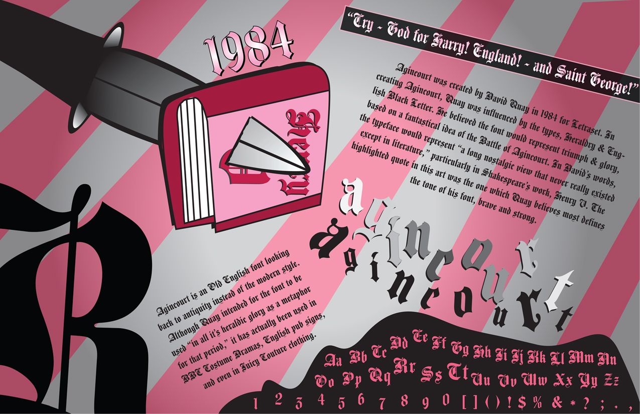
Fortune Favors the Bold

Vernacular Typography, Art 293
Alexandra Barron
Dayna Bieber
Matthew Boswell
Francisco Cabana
Emma Cason-Pratt
Stephanie Colbert
Jessica Page
Taylor Palmer
Pedro Rodriguez
Jonathan Turner
Maria Urbano
Lauren Whiddon


Thursday, October 22, 2009


Tuesday, October 20, 2009
exploring magazine layout

we had to make a magazine layout, but I wanted to give it something more than a generic, simple spread. i had worked on a magazine over the summer that was stylishly simple, with lots of white space. i am also the creative director of distraction magazine here at UM, so the whole 'rectangle' magazine thing wasn't going to cut it for this assignment.
i wanted to make it really unique. something unexpected. so, i made it an oval shape--when it is opened. the content could be anything, but i chose outer space and dark energy since it was on my mind at the time.
enjoy!
-stacey nicole coon
LOGO REMAKE with a twist.

the assignment- remake a nutrition chart or something of the like....
forgettaabouttittt.
i remade an old album label for the grateful dead-- one of the most amazing bands ever...and they never even had a single on the charts. but anyone who knows them can sing almost any song word for word.
so, who needs a chart?
:)
stacey nicole coon
Recent Work
If only Miami was in the running for the 2012 olympics....


Sample packaging for baby products
by Emma Cason-Pratt
Editorial - Satirical Style

An Editorial assignment. I had to make an image that went with the article. the picture portrays a comment made towards the end of the article and the article itself is from The Onion; a satirical newspaper. The layout is European in design but of some middle of nowhere paper of Montana and a Sunday Edition at that.
Lucid Dreams graphic novel
 A work in progress. This spread's notable reference includes Sōsuke from Ponyo on the Cliff by the Sea. I will alter him. Right now, my focus is on creating a logo to establish the projects identity. The aim of this spread is to show my heroine's boredom to mundane camp life. Simultaneously, this spread shows survivors dependancy of the protagonist. Color scheme has not yet been finalized, but it aids my process.
Dramatic Lighting - LOTR

This is a pencil drawing I made to illustrate a scene in a narrative using dramatic lighting and more than one character. It is a moment in The Lord of The Rings when a Wraith sneaks up on sleeping Frodo and Sam. The sleeping hobbits and the half-hidden attacker creates a satisfying suspense and expectation; a moment captured.
Book Cover Redesign

Watership Down by Richard Adams is one of my favorite books and one of the most loved works of english literature. For the cover I decided to capture the moment when Hazel, Fiver, and the others depart their Warren (home) and start they're journey to find another; the moment right before they cross the river - the last chance to turn back.


the DENSMORE typeface

This simple project turned into an intriguing search for the designer of the self titled album cover from The Doors. I spoke with Ray Larabie on numerous occasions about the typeface, and even inspired him to update the current one- which he did, after seeing my final design. He actually sent me the updated version for free, when he charges about $20 for the new version. I never got to find the original artist, but the search is still on!
My Name

I chose the font "Gasmask" because it is a very bold and "in your face" font. The name "Andrew" can mean Man, Manly, Courageous, or even Warrior. This font also utilizes a basic Stencil typeface which is heavily used by military graphics. The two gasmask images are actually part of the font (parenthesis).

Bitmap Font Project

This bitmap font uses a 5x5 square grid for both the lower and upper case letters. By omitting some of the squares that would connect segments of the letters, it creates a unique futuristic and almost alien feel, hence the name "Alien Technology."


This magazine cover was created to show the design aspect of the "Didot" modern typeface. The The layout is intended to look contemporary and to follow the Bauhaus style. The inspiration behind this style comes from the Swiss grid, aesthetically clean, simple, white space and orderly. Color was just a touch of elegance and balance while using black, whites and grays emphasizes the hierarchy of words. The forward taken picture connotes the meaning of simplicity.
ART 291
by Juliana Aragao


Green Eggs and Ham Book Cover
 This is an alternative book cover to the beloved children's book by Dr. Seuss, Green Eggs and Ham.
Book Cover Illustration


Jacqueline Tumas
Book cover Illustrations for Hard Boiled Wonderland and the End of the World.
The first cover would be used for general release, the second cover would be a limited edition retro release.

Editorial Illustration

Children Book Illustration
 Jacqueline Tumas
Illustration for Robert Louis Stevenson's poem "The Swing".
The two girls show completely different emotions that are experienced on a swing.
Friday, October 16, 2009

Tuesday, October 13, 2009
Friday, October 2, 2009
Lucid Dreams
The heart of this exercise is a unique repressed revelation rooted in doubts and fears. This is the first of six illustrations that will be produced in ART592. They deal with interpretation catastrophic scenarios that have appeared in my dreams. It involves the fundamentals of surrealism, Taoism, and Anime. Artist that are a direct influence to these images are Salvador Dali, Takashi Murakami, and Hayao Miyazaki. This work is still in progress.

Maribel Cardona
Thursday, October 1, 2009
Dive Head First into Motion Graphics
I used a freelance project I'm currently working on in which the client requested an "introduction" as my first test of what I can do with motion. The client wanted a "dark and grungy" look. So I came up with a concept, created the objects in Photoshop, created the audio from sound clips, and sat down to learn some basic AfterEffects through trial and error.

Title: Introduction of Doom
Client: Stout Leather (Malibu, CA)
Software: Adobe Photoshop, Adobe Soundbooth, Adobe AfterEffects, Adobe Illustrator
Designer: Rafael Jadoo
Class: ART592
View Introduction Video
(note: the website is still in development)
Title: Introduction of Doom
Client: Stout Leather (Malibu, CA)
Software: Adobe Photoshop, Adobe Soundbooth, Adobe AfterEffects, Adobe Illustrator
Designer: Rafael Jadoo
Class: ART592
View Introduction Video
(note: the website is still in development)
Subscribe to:
Posts (Atom)